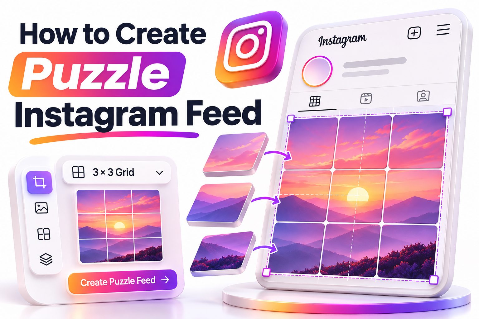
A puzzle Instagram feed turns individual posts into pieces of one larger image, creating a striking profile grid when someone visits your account. The effect can make a launch, portfolio, event, or brand campaign feel carefully planned—but it requires more than slicing one photograph into nine squares.
Learning how to create puzzle Instagram feed designs starts with understanding how Instagram arranges posts. New uploads appear in the first position of your profile grid, pushing older content across and down. That means every tile must be designed and published in the correct order. You also need to consider how each post looks in the feed, where followers usually see it on its own.
This article walks you through the complete process: choosing a grid size, planning the composition, building and splitting the design, uploading tiles correctly, and maintaining the layout afterward. You will also learn which tools are useful, how to avoid common posting errors, and when a less complicated grid style may be a better choice. By the end, you will have a practical workflow for creating a puzzle feed that looks cohesive without making individual posts confusing or unusable.
Planning a Puzzle Feed That Works
Before opening a design app, decide what the grid needs to accomplish. A puzzle layout created for a product launch has different requirements from one built for an artist’s portfolio. Clarifying the purpose helps you choose suitable images, calls to action, captions, and the number of tiles.
Most puzzle feeds use three, six, nine, or twelve posts because Instagram profiles display three columns. A nine-tile design is often the most practical starting point: it creates a clear visual effect without requiring an excessive publishing schedule. Larger grids offer more room but are harder to maintain.
Choosing the Right Grid Size
A three-tile row works well for announcements, panoramic photographs, and short campaigns. It is quick to publish, but the visual effect disappears as soon as you add another post unless you continue publishing in groups of three.
A six- or nine-tile puzzle gives you more creative space for photography, typography, and illustrations. Twelve or more tiles can create an immersive profile, yet visitors may need to scroll to see the entire image. Larger designs also increase the risk of misaligned details.
Planning for Profile and Feed Views
The complete composition appears only when someone visits your profile. Followers generally encounter one tile at a time in their home feed. Each piece should therefore contain enough visual information to make sense independently, even when it is part of a larger image.
Avoid placing essential text, faces, or product details directly across tile boundaries. Slight cropping differences can make split elements look awkward. Position the most important content near the center of individual tiles and use backgrounds, textures, shapes, or decorative lines to connect the broader composition.
Preparing the Visual Concept
A polished puzzle feed needs a consistent visual system. Choose a limited color palette, one or two typefaces, and a repeatable treatment for photographs. These decisions make the design feel connected even when individual posts feature different subjects.
Collect your brand assets before designing, including logos, product images, portraits, icons, textures, and approved colors. A simple mood board can reveal whether the materials belong together. For more help developing a consistent visual direction, see [Internal Link: Instagram Branding Tips].
Creating a Rough Grid Sketch
Sketch the layout as a three-column grid before working on the final canvas. Mark where headlines, photographs, calls to action, logos, and decorative elements will appear. The sketch does not need to be beautiful; its purpose is to expose crowded areas and weak individual tiles.
Assign a role to each post. One tile might introduce the campaign, another might feature a product, and a third might carry a testimonial. This approach prevents the finished puzzle from becoming one large picture with several meaningless fragments.
Building Visual Connections Between Tiles
Use large background shapes, continuous lines, overlapping photographs, or gradual color changes to guide the eye across the grid. These elements create the puzzle effect without forcing every important object to span multiple posts.
Keep the connections subtle enough that the tiles remain useful alone. A curved line can leave one post and continue into another, while the main photograph stays fully visible. This balance supports both profile visitors and followers viewing posts individually.
Puzzle Feed Planning Checklist
Before designing the final layout, confirm that you have:
- Chosen a clear purpose for the feed
- Selected a grid size based on three columns
- Assigned useful content to every tile
- Defined your colors, fonts, and image style
- Gathered high-resolution visual assets
- Kept key text away from tile boundaries
- Planned each tile to work as a standalone post
- Decided how the grid will continue after publication
- Prepared a backup copy of the full composition
- Checked that the design supports your wider content strategy
Setting Up the Master Canvas
The master canvas is the large design that will later be divided into equal square tiles. Its dimensions depend on the number of rows. Each tile should use the same width and height so the pieces align cleanly when displayed on your profile.
A practical working size is 1080 pixels per tile. For a three-column, three-row puzzle, create a canvas measuring 3240 by 3240 pixels. A three-column, two-row design requires 3240 by 2160 pixels, while a single row requires 3240 by 1080 pixels.
Common Canvas Dimensions
Use these dimensions for square puzzle tiles:
| Grid layout | Number of posts | Master canvas size |
|—|—:|—:|
| 3 columns × 1 row | 3 | 3240 × 1080 px |
| 3 columns × 2 rows | 6 | 3240 × 2160 px |
| 3 columns × 3 rows | 9 | 3240 × 3240 px |
| 3 columns × 4 rows | 12 | 3240 × 4320 px |
| 3 columns × 5 rows | 15 | 3240 × 5400 px |
These sizes assume that every exported tile will be 1080 by 1080 pixels. You can work at a larger resolution when necessary, provided the canvas keeps the same proportions and is divided into three equal columns.
Adding Guides and Safe Areas
Place vertical guides every 1080 pixels to mark the three columns. Add horizontal guides at the same interval for each row. Turn on snapping if your software provides it, but inspect every boundary manually before exporting.
Create an internal safe area inside each tile. Keeping text and logos at least 80 to 100 pixels from a tile edge reduces the chance of cramped compositions. It also provides flexibility if Instagram’s profile preview or interface treatment changes how the post is displayed.
Designing the Complete Puzzle Layout
Build the background first, then add major photographs, followed by headings, supporting text, and decorative details. Working from large elements to small ones makes it easier to control the visual hierarchy across the entire grid.
Zoom out regularly to inspect the full composition, then zoom in to evaluate each tile. Both views matter. A layout can look impressive from a distance while containing individual posts with half a face, a disconnected letter, or no meaningful focal point.
Handling Text Across the Grid
Keep complete words and sentences inside one tile whenever possible. Splitting a headline across multiple posts makes it difficult to read in the home feed and can look broken if the posts are displayed in a different context.
For a campaign title that must span several tiles, treat it as a decorative profile element and repeat the essential message within individual captions or graphics. Important information such as dates, prices, URLs, and instructions should never depend on two tiles appearing side by side.
Balancing Detailed and Simple Tiles
Not every tile needs a photograph, headline, logo, and call to action. Alternating detailed posts with quieter tiles creates visual breathing room. A simple color field with a short phrase may be more effective than another crowded collage.
Use repetition to hold the grid together. The same corner treatment, line weight, texture, or accent color can appear throughout the puzzle. Repetition makes varied content feel intentional while allowing each tile to communicate a different message.
Building the Design in Popular Tools
You can create a puzzle grid in Canva, Adobe Photoshop, Adobe Express, Affinity Photo, or another program that supports custom dimensions and accurate cropping. The best choice depends on your design experience and the level of control you need.
Canva is accessible and suitable for straightforward layouts. Photoshop and Affinity Photo provide stronger guide, layer, masking, and export controls. Mobile grid-splitting apps are convenient, but their output should be checked carefully because compression, numbering, and privacy practices vary.
Canva Workflow
Create a custom design using the total master-canvas dimensions for your chosen grid. Add ruler guides or use a grid element as a temporary alignment reference. Lock the guide layer so it does not move while you arrange images and text.
When the design is finished, export the complete canvas as a high-quality PNG. Canva may not provide the same slicing controls as professional desktop software, so you may need a trusted image-splitting tool to create the individual square files.
Photoshop Workflow
Create a document at the required size, then add guides at 1080-pixel intervals. Use layers and groups to organize backgrounds, images, typography, and tile-specific content. Smart Objects can preserve image quality while you resize assets.
Photoshop’s Slice tool can divide the canvas along the guides and export the pieces. Alternatively, crop and export each square with consistent coordinates. Name every file according to its visible position and intended upload sequence to prevent mistakes later.
Quick Tool Comparison
| Tool | Best for | Main advantage | Main limitation |
|—|—|—|—|
| Canva | New and occasional designers | Simple templates and drag-and-drop editing | Less control over precise slicing |
| Photoshop | Detailed professional designs | Accurate guides, layers, and export options | Higher cost and learning curve |
| Affinity Photo | Desktop design without a subscription | Strong layout and image-editing controls | Smaller template ecosystem |
| Adobe Express | Quick branded graphics | Convenient brand assets and resizing | Limited advanced composition controls |
| Grid-splitting apps | Dividing a finished image | Fast mobile workflow | Quality, numbering, and privacy vary |
Splitting and Exporting the Tiles
Once the master composition is complete, divide it into equal 1080-by-1080-pixel images. Every tile must have identical dimensions. Even a small difference can create inconsistent crops or quality across the published grid.
Export as PNG when the design includes text, logos, or flat graphics. A high-quality JPEG can be suitable for photography and usually creates smaller files. Review the exported tiles at full size to confirm that text remains sharp and boundaries align.
Naming the Files Clearly
Use descriptive filenames that identify both the tile’s position and publication order. For example, “top-left,” “middle-center,” and “bottom-right” describe visual placement, but a separate upload number makes publishing safer.
A nine-tile grid could use names such as “01-bottom-right,” “02-bottom-center,” and “03-bottom-left.” This naming system reflects the order in which the posts should be uploaded. Keep the master file and unsplit export in the same project folder for future corrections.
Checking Each Tile Independently
Open every exported square by itself. Look for clipped words, isolated body parts, tiny details, unintentional blank areas, and elements touching the edges. A tile that appears fine inside the full layout may feel confusing when separated.
Confirm that each post has a clear focal point. Some abstract connector tiles can be simpler, but they should still match the account’s style. If a tile contains no useful subject, consider adding a short message, texture, product detail, or recognizable brand element.
Publishing the Puzzle in the Correct Order
Instagram places the newest standard post at the beginning of the profile grid. To assemble a puzzle correctly, publish the master design in reverse visual order, starting with the bottom-right tile and finishing with the top-left tile.
For a nine-post layout, upload the bottom row from right to left, then the middle row from right to left, and finally the top row from right to left. After the last post is published, the profile should display the intended composition.
Nine-Tile Upload Sequence
Use this order for a three-by-three puzzle:
1. Upload the bottom-right tile.
2. Upload the bottom-center tile.
3. Upload the bottom-left tile.
4. Upload the middle-right tile.
5. Upload the middle-center tile.
6. Upload the middle-left tile.
7. Upload the top-right tile.
8. Upload the top-center tile.
9. Upload the top-left tile.
10. Refresh your profile and inspect the complete grid.
Instagram’s profile-management features can change, and some accounts may have options to rearrange or adjust profile content. Do not rely on features that may be unavailable to every account. Planning the traditional reverse upload order remains the safest workflow.
Managing the Publishing Session
Prepare all captions, hashtags, alt text, product tags, and links before posting the first tile. This reduces delays and limits the chance of selecting the wrong file. Store the text in a document labeled with the same numbers as the image files.
Publish the tiles close together if the complete puzzle must appear immediately. Bear in mind that posting nine images in rapid succession can dominate followers’ feeds. For many campaigns, a carousel or phased grid provides a less intrusive alternative.
Creating Captions That Add Value
Avoid using nine nearly identical captions. Each post should offer a useful piece of the wider story: a product benefit, event detail, customer quote, behind-the-scenes note, or instruction. Related captions can form a sequence without repeating one another.
The first tile followers see during the upload process will not necessarily be the opening message in the final design. Write captions that make sense independently. Add clear context rather than relying on visitors to view the full profile first.
Maintaining the Grid After Launch
A puzzle feed is temporary unless every future post follows the same three-column rhythm. Publishing one new image shifts every existing tile, breaking the larger composition. Posting three new images moves the puzzle down by one complete row and preserves its alignment.
Plan the next row before launching the puzzle. It can continue the same visual system or transition into a simpler style. A consistent three-post publishing rhythm is useful for alignment, although it may feel restrictive for accounts that need to share timely content.
Using Pinned Posts Carefully
Pinned posts can change the order in which content appears at the top of a profile. While pinning is useful for keeping important information visible, it may disrupt a puzzle layout if the design was based on chronological placement.
Decide whether the puzzle or the pinned content has priority. Test the profile after pinning anything, and avoid assuming that every visitor sees an identical arrangement across devices or future interface updates.
Archiving and Reusing Puzzle Content
Do not delete the original project once the campaign ends. The full image, individual tiles, captions, and upload map can be reused for case studies, website graphics, Stories, or future launches.
If you archive one tile, the remaining puzzle may shift or develop a visible gap. Archive the complete set when retiring the campaign, or leave the grid intact and move it downward by publishing full rows. For broader planning help, see [Internal Link: Instagram Content Calendar Strategy].
Puzzle Feed Maintenance Dos and Don’ts
Do:
- Publish new content in complete rows when preserving alignment
- Keep editable source files and numbered exports
- Review the profile after pinning or archiving posts
- Plan the next row before the current campaign ends
- Use Stories or other formats for urgent content between grid updates
- Record the intended order in a simple upload map
Don’t:
- Delete or archive a single tile without checking the result
- Depend on followers seeing the whole grid before reading a post
- Place critical information only across tile boundaries
- Assume a mobile splitting app numbered files correctly
- Sacrifice regular content needs just to protect the puzzle
- Publish an unplanned post in the middle of the sequence
Common Puzzle Feed Mistakes
The most frequent mistake is uploading the top-left tile first. Because new posts appear at the beginning of the profile, this reverses or scrambles the design. Numbering files according to upload order is the easiest safeguard.
Another common issue is designing only for the completed profile. Tiles containing fragments of text, empty backgrounds, or cropped faces may confuse followers. A successful puzzle grid must work at two levels: as one large composition and as a collection of individual posts.
Overloading the Design
Puzzle layouts already contain visual movement, so too many fonts, colors, stickers, and overlapping photographs can create clutter. Limit the palette and allow some tiles to remain simple. White space is useful when it directs attention rather than appearing accidental.
Check the grid at thumbnail size. If the focal points disappear or the headline becomes unreadable, simplify the composition. Strong contrast and clear scale matter more than filling every area with content.
Ignoring Profile Cropping
Instagram image posts may support several aspect ratios in the feed, but puzzle designs depend on predictable profile-grid previews. Square source files remain the simplest choice because each tile is designed around equal dimensions.
Interface presentation can evolve, so avoid relying on edge-to-edge alignment for tiny text or precision-critical details. Build tolerance into the design by using broad shapes and generous margins. Always preview the result on the actual account before promoting it.
Troubleshooting a Misaligned Puzzle
Start by confirming that all tiles are present and that no unrelated post was published during the sequence. Count the posts, compare filenames with the upload map, and inspect the order from newest to oldest.
If one tile is incorrect, replacing it may affect the position of every other post. When the puzzle has just been uploaded and has little engagement, republishing the full sequence may be the cleanest correction. Preserve captions before removing anything so they can be restored accurately.
When Tiles Appear in the Wrong Positions
A reversed row usually means the files were uploaded left to right instead of right to left. A vertically inverted layout suggests that the top row was published first. Compare the current profile against a numbered thumbnail map to identify the exact ordering error.
Avoid repeatedly deleting and re-uploading random tiles. That approach can make the sequence harder to diagnose. Reconstruct the intended publication order on paper, then correct the complete set in one controlled session.
When Image Edges Do Not Match
Misaligned edges often result from uneven crops, incorrect master-canvas dimensions, or exports that were resized individually. Return to the original canvas, verify the guides, and export all tiles again using one consistent method.
Small mismatches can also come from placing narrow lines directly on boundaries. Widen the connecting elements or move them away from the edge. Broad color fields and large shapes tolerate minor display variations better than one-pixel lines.
Quick Troubleshooting Checks
- Confirm that the grid contains the expected number of posts
- Check for an unrelated post inside the sequence
- Verify that every file is square and equally sized
- Compare the live profile with a numbered grid preview
- Confirm that posting started at the bottom-right tile
- Inspect pinned posts that may affect profile order
- Re-export the entire set if dimensions differ
- Test broad connecting shapes instead of narrow boundary lines
- Save captions before republishing corrected tiles
Alternatives to a Traditional Puzzle Feed
A full puzzle layout is visually distinctive, but it is not ideal for every account. It can restrict spontaneous posting, weaken individual posts, and require followers to visit the profile to appreciate the design. Simpler grid systems can offer consistency with less maintenance.
An alternating pattern uses two recurring post styles, such as photography and text graphics. A row-based theme groups three related posts together, while a consistent border or color palette creates cohesion without connecting the images physically.
Carousel Posts
A carousel can present one large concept as several swipeable slides without affecting the profile grid beyond a single post. It is often better for tutorials, before-and-after content, product features, and storytelling because the viewing order is controlled.
Carousels also allow every slide to use the full available space. Choose this format when the audience needs to follow a sequence or read detailed information. Reserve puzzle grids for campaigns where the profile-level visual impact serves a clear purpose.
Three-Post Panoramas
A three-tile panorama provides the puzzle effect with less effort. It works especially well for landscape photography, campaign banners, event announcements, and collection launches. The files still need to be uploaded from right to left.
The limitation is the same: each new post shifts the panorama. Publishing the next three posts as a complete row preserves alignment. Make sure each section contains enough detail to remain visually interesting when seen alone.
Consistent Visual Systems
A recognizable feed does not require connected images. Repeating typography, colors, photo treatments, and spacing can produce a polished profile while allowing posts to be published individually.
This approach is more flexible for businesses that share news, user-generated content, promotions, and timely updates. It also reduces the risk of a single removed post damaging the presentation of surrounding content.
Best Practices for a Useful Puzzle Feed
Treat the puzzle as a content campaign, not merely a decoration. Every tile should support a communication goal through its image, caption, or call to action. A beautiful grid that leaves followers confused is less effective than a simpler layout with clear information.
Measure the campaign using relevant outcomes such as profile visits, website clicks, saves, shares, comments, product views, or registrations. Likes alone do not reveal whether the larger composition helped people understand or act on the message.
Design for Accessibility
Use readable type sizes, strong color contrast, and concise wording. Add meaningful alt text to each post based on what the individual image communicates. Do not describe only its position in the puzzle; explain the visible subject and relevant text.
Avoid making the full grid the only place where essential information appears. Dates, prices, addresses, and instructions should also be included in captions or accessible landing pages. This helps people using assistive technologies and anyone who sees only one tile.
Test Before Publishing
Create a mock profile grid using thumbnails of the exported images. Place the newest image in the first position and verify that the sequence forms the intended design. This simple preview catches most ordering mistakes.
Ask someone unfamiliar with the project to review both the full composition and several standalone tiles. If they cannot identify the main message, revise the layout before publication. Fresh eyes often catch split words, unclear calls to action, and distracting transitions.
Practical Pre-Publishing Review
Before the first upload:
1. Confirm the full design matches the campaign objective.
2. Check every tile at full size and thumbnail size.
3. Verify that essential text stays within one tile.
4. Confirm all files use identical dimensions.
5. Number the exports in reverse upload order.
6. Match each caption to the correct numbered image.
7. Prepare alt text and relevant tags.
8. Preview the tiles in a mock three-column grid.
9. Check that no scheduled post will interrupt the sequence.
10. Plan the next three posts to protect the layout.
Conclusion
A strong puzzle feed begins with planning, not slicing. Choose a grid size that suits the campaign, design on a correctly proportioned master canvas, and give every tile a useful standalone purpose. Broad visual connections, consistent branding, and generous safe areas help the final composition feel unified without sacrificing clarity in the home feed.
The publishing order matters just as much as the design. Number the files carefully, begin with the bottom-right tile, and work from right to left through each row. Prepare captions and alt text in advance, then inspect the live profile before promoting the campaign. To preserve the design afterward, publish future content in complete rows of three or move to a more flexible visual system.
The most practical lesson in how to create puzzle Instagram feed content is to balance profile impact with everyday usability. Use the technique when a launch, event, portfolio, or campaign genuinely benefits from a large connected visual. When regular posting flexibility matters more, a carousel, panorama, or consistent branded grid may serve the audience better.
Frequently Asked Questions
How many posts are best for a puzzle feed?
Nine posts are a practical choice because they create a complete three-by-three composition without becoming difficult to manage. Three or six posts suit shorter campaigns, while twelve or more require greater planning and maintenance.
What order should puzzle tiles be posted?
Start with the bottom-right tile and publish each row from right to left. Move upward one row at a time, finishing with the top-left tile. This reverse sequence creates the correct arrangement on the profile.
Can Canva create a puzzle Instagram feed?
Yes. Create a custom canvas based on 1080 pixels per tile, design the full composition, and export it at high quality. You may need a separate trusted splitting tool to divide the canvas into squares.
Will a new post break the puzzle layout?
Yes, one new standard post shifts the existing tiles and disrupts their alignment. Publishing three new posts moves the puzzle down by a complete row, preserving the original arrangement across Instagram’s three-column profile grid.
Are puzzle feeds still useful for businesses?
They can be useful for launches, portfolios, events, and short campaigns where profile impact matters. For businesses that publish frequent updates, a flexible branded grid or carousel strategy is usually easier to maintain.